
The unique packaging features of square paper tubes surpass what cylindrical containers can provide. The four-sided design of these structures enables flat printing areas and stable stacking features and contemporary design elements which attract modern consumers. Multiple business sectors have started using square tubes as a way to establish product differentiation.
What Are Custom Square Paper Tubes?
Definition and Structure
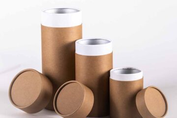
The definition of custom square paper tubes describes them as rigid packaging containers made from layered paperboard or kraft material which have four flat sides and square cross-sections. The printing area of square tubes exceeds round tubes by 30-40% while maintaining standard dimensions between 2×2 inches and 6×6 inches.
Who Uses Square Tube Packaging
Several industries benefit from square tube designs:
-
The cosmetic industry uses square tubes to package their beauty and skincare products.
-
Premium tea and coffee businesses select square tubes to package their high-end blends.
-
The confectionery industry uses square tubes to package their chocolate and candy products.
-
The manufacturing sector of tech accessories produces cables and earbuds which use square tube packaging.
-
Candle manufacturers who want contemporary packaging solutions choose square tubes.
Why Choose Square Over Round
| Feature | Square Tubes | Round Tubes |
|---|---|---|
| Printing surface | 4 flat panels | Curved wrapping |
| Stacking stability | Excellent, no rolling | Requires restraints |
| Shelf efficiency | 25% more products per shelf | Wasted corner space |
| Premium perception | Modern, architectural | Traditional, common |
| Shipping density | Higher product-to-box ratio | More void fill needed |
Minimalist Monochrome Design for Custom Square Paper Tubes
Single Color Impact
The use of one or two colors in minimalist designs produces powerful visual effects. The combination of black tubes with white typography or white tubes with black graphics produces a sophisticated look that avoids overwhelming customers. The design method delivers excellent results for high-end skincare companies and high-end tea manufacturers.
Typography as Primary Element
The use of basic color schemes enables typography to take center stage as the main design element.
The design of modern brands employs strong sans-serif fonts while heritage products use elegant serif fonts and artisanal goods benefit from hand-lettered styles and tech accessories use geometric fonts.
Where Minimalism Works Best
The following settings benefit from clean design approaches:
-
High-end retail boutiques with curated selections
-
Online stores where photography clarity matters
-
Gift markets targeting sophisticated buyers
-
Spa and wellness product categories
Geometric Pattern Applications
Repeating Shape Designs
The four sides of custom square paper tubes become visually harmonious through geometric pattern designs. The use of triangles and hexagons and diamond shapes in solid or gradient colors creates visual interest without needing elaborate illustrations. The patterns look great when photographed for social media content.
How to Implement Patterns
-
Choose 2-3 complementary shapes
-
Establish consistent spacing rules
-
Apply gradient or dual-tone coloring
-
Reserve one panel for brand information
-
Test pattern scale at actual tube size
Pattern Style Recommendations
| Pattern Type | Brand Personality | Target Audience | Design Complexity |
|---|---|---|---|
| Linear grids | Professional, organized | Corporate gifts | Low |
| Organic shapes | Natural, approachable | Wellness products | Medium |
| Abstract forms | Creative, artistic | Designer goods | High |
| Dot matrices | Technical, modern | Tech accessories | Low |
| Interlocking | Sophisticated, premium | Luxury items | High |
Window Cutout Features
Strategic Product Visibility
The use of die-cut windows in square tubes enables customers to view their products before making a purchase. The Tube Packaging team recommends placing windows on front panels for maximum retail effect especially when showing products with attractive visual elements such as colorful soaps and teas and candies.
Window Shape Options
Common cutout designs include:
-
Circular windows centered on front panels
-
Vertical rectangular strips showing product height
-
Diamond or hexagonal shapes for geometric consistency
-
Logo-shaped cutouts reinforcing brand identity
-
Multiple small windows creating pattern effects
When to Add Windows
Windows work best when:
-
The products display attractive colors and textures which customers want to see.
-
Customers want to check the contents before making their purchase decision.
-
The retail environment offers sufficient illumination.
-
The product displays exceptional visual appeal to customers.
-
The competition uses packaging that blocks visibility.
Embossed and Debossed Elements
Textural Dimension Benefits
The combination of raised and recessed designs creates tactile interest on flat surfaces. The manufacturing process of flat panels accepts pressure uniformly because embossing produces raised elements and debossing creates sunken designs. The manufacturing process of custom square paper tubes benefits from these techniques because flat panels distribute pressure uniformly during production.
Application Areas
Strategic embossing locations:
-
Premium feel emerges from placing brand logos on the lid surfaces.
-
The product information section receives decorative border patterns that create visual interest.
-
The decorative corners serve to enhance product details.
-
Product icons serve to confirm what is inside the package.
-
The background texture serves as a printed text support element.
Cost and Production Considerations
The implementation of embossing techniques requires additional financial costs.
-
The cost of creating dies amounts to $100-$300 for one-time use.
-
The cost of each unit increases between $0.15 and $0.40 based on design complexity.
-
The production of embossed products requires a minimum orders between 1,000 to 2,500 units.
-
The production duration extends by 3-5 days when embossing is applied.
-
The recommended paper weight for embossing operations reaches 300 GSM and above.
Metallic Foil Accents
Foil Application Techniques
Hot foil stamping enables designers to apply metallic finishes to particular design elements which are applied to square tubes. The flat design of square tubes enables better foil application than curved surfaces because it produces precise details and uniform coverage.
Foil Color Selection
Different metallic finishes deliver distinct brand messages to consumers.
-
The premium feel of gold foil makes products appear luxurious while supporting high-end pricing strategies.
-
The silver foil represents modern technology while also appealing to contemporary consumers.
-
The rose gold finish appeals to feminine consumers who want trendy products.
-
The copper finish creates an artisanal impression that suggests handmade production methods.
-
The holographic finish appeals to young consumers because it creates attention-grabbing visual effects.
The Effective Use of Foil in Design
The application of foil should be limited to specific design elements instead of covering all surface areas.
-
The use of foil should focus on making logos more recognizable while also drawing attention to words like “organic” and “handmade.”
-
The design includes windows and decorative borders which receive accent treatment.
-
The design incorporates shiny elements to specific pattern components.
-
The design achieves contrast through its shiny elements against matte background surfaces.
Illustrative Storytelling Designs
Custom Artwork Integration
The use of original illustrations enables packaging to function as a storytelling platform for brands. The four panels of square tubes enable sequential artwork presentation which generates narrative experiences when customers turn the tubes. The method establishes emotional bonds which surpass standard packaging functionality.
Illustration Styles and Applications
-
The use of botanical illustrations suits products containing natural ingredients.
-
The abstract art style suits creative brands and artistic companies.
-
The minimalist design approach uses line illustrations as its primary visual element.
-
The watercolor design technique creates a soft appearance that suits products with organic characteristics.
-
The use of vintage engravings helps brands establish heritage positioning in the market.
Who Benefits From Illustrated Packaging
The following types of businesses achieve the best results with illustration-based packaging designs:
-
Small businesses that produce handmade items benefit from illustration-based packaging.
-
Brands with compelling historical backgrounds and founder stories benefit from illustration-based packaging.
-
The packaging appeals to customers who purchase gifts because it offers distinctive designs.
-
Companies that want to stand apart from standard market competition use illustrated packaging.
-
The need for packages that work well with photography exists for e-commerce businesses.
Material and Finish Combinations
Paper Stock Options
The selection of base materials determines how the final product will look.
-
Kraft paper provides an eco-friendly appearance while maintaining a natural look.
-
White cardstock provides a clean appearance which creates modern designs.
-
Black paper creates powerful dramatic effects through its bold appearance.
-
The addition of textured papers creates a touchable surface effect.
-
The use of recycled materials in packaging helps customers understand the brand’s commitment to sustainability.
Surface Treatment Effects
The appearance and touch of products change when manufacturers apply different finishing techniques.
-
Matte lamination produces flat surfaces which do not reflect light.
-
The application of gloss coating enhances color brightness in products.
-
Soft-touch lamination produces a velvety surface texture on materials.
-
Spot UV creates visual distinction between matte and glossy elements.
-
The uncoated paper maintains its natural texture while keeping its paper feel intact.
Implementation Guidelines
Design Development Process
The following sequence of steps leads to successful tube design creation:
-
The first two weeks of the process involve researching competitor packaging and collecting design inspiration.
-
The third to fourth weeks involve creating first design concepts through mockup development.
-
The fifth to sixth weeks involve reviewing samples to select the best design direction.
-
The seventh to eighth weeks involve completing artwork development and preparing print files for production.
-
The ninth to tenth weeks involve physical sample approval before starting production.
-
The eleventh to twelfth weeks involve receiving and testing the completed production units.
Quality Control Checklist
The following checks need to be performed before starting large-scale production:
-
The tubes need to have dimensions which match the dimensions of the products.
-
The printed colors need to match the brand standards as defined in the guidelines.
-
The product needs to have proper lid fit and easy opening functionality.
-
The evaluation process includes assessment of print quality and registration accuracy.
-
The evaluation process includes testing of paper weight and product durability.
-
The final step involves verifying that all finishing operations match the specified requirements.